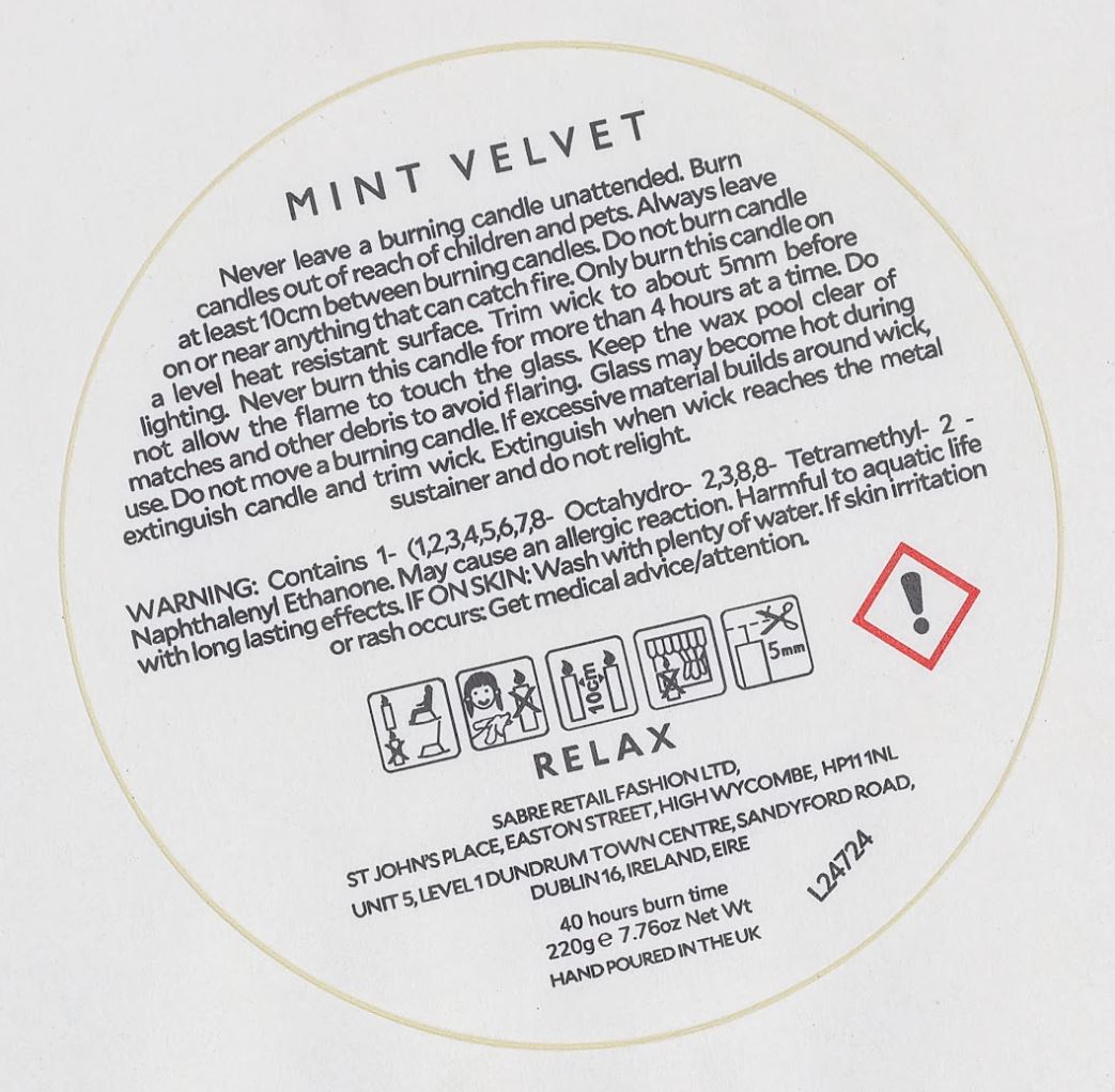
Why your candles need our labels
Candle labels are regularly exposed to heat, wax and handling, and, as such, they need to be resistant and durable. Our labels are made with biaxially oriented polypropylene film, which is weatherproof, heat- and oil-resistant, and can withstand temperatures from -30 to 80°C. Vinyl is slightly more expensive than some of our paper label options, but it will not discolour when exposed to a candle’s heat and oils.
We also use state-of-the-art HP Indigo 6000 digital printing equipment and high-grade inks, so your candle labels will look pristine in the (candle) light. Some chemicals in candles can affect ink quality, so if this is a concern, we recommend adding a gloss or matte lamination for extra durability.
Add a Personalised Touch
Candle labels express the unique personality of your midsize or luxury candle brand. They can evoke tranquillity through gentle, lavender-scented soy candles, showcase bold citrus fragrances alongside vibrant wax colour combinations, or highlight a connection to nature by complementing the honey-like aroma of beeswax candles paired with forest and wood scents. For candles packaged in jars, you could also consider using our specialised
jar labels to further enhance your branding.
Our team of in-house print and design technicians are ready to help turn your candles into works of art. For instance, you could:
Evoke calmness with a white matte finish and pastel colouring;
Use black gloss and metallic accents for something that looks striking in candlelight;
Even utilise textured paper to make your labels more natural-looking and eco-friendly (although paper will not have the heat-resistance or durability of our material).
If you’re ready to complete your candles with heat-resistant, fully customisable candle labelling, enter your order requirements into our price calculator.
Label Features and Extra Info

CLP Regulations & Safety Information
Any candle that goes on the UK market needs to comply with Classification, Labelling and Packaging of chemicals legislation (CLP) Regulations. This means that all required CLP information needs to be attached directly to the candle as a separate label. This CLP label can also be attached to a vessel that contains the candle (such as a candle jar or tin).
The CLP label needs to include the appropriate signal word, hazard pictograms, hazard and precautionary statements, and supplier contact details. Depending on the formulation, additional ingredient or allergen disclosures may also be required.
For more information on CLP Regulations, take a look at our dedicated CLP Labels page
Candle Label Materials & Adhesive Considerations
We print our candle labels in the UK on a specialist vinyl label film, which is heat-resistant up to 80°C (or 95 °C for short periods), so it can withstand most melted candle wax temperatures.
Rather than using paper, which can scorch or discolour when exposed to heat and oils., we use a self-extinguishing vinyl that is more heat tolerant and better suited for use on candles. It is also resistant to mineral oils, fats, aliphatic solvents, fuels, mild acids, salts, paraffin, hydraulic oil, soap suds and other alkalis.
Please note that some chemicals can affect ink durability unless a lamination is applied. Learn more about our
waterproof stickers and labels.
We also use a permanent, or high-tack, adhesive on our candle labels to ensure reliable adhesion, even when exposed to elevated temperatures.
Ready to order your candle labels? Printed to order in the UK with a 1–3 working day turnaround. Use the calculator above to choose your size, material, finish and quantity.